
I am working on creating CSS-only versions of some components from Material Components Web, Google’s implementation of Material Design for the web. Material Design is what Google calls a ‘design language’. A way of thinking about the user interface. Google is implementing it across its product line, so you have undoubtedly seen it before.
In Material Design, drop shadows play a functional role. So a header bar usually does not have a drop shadow until the page scrolls. When scrolling, the content has to slide behind the header bar, so the header bar gets a drop shadow to show that it is closer to the viewer than the content which is sliding underneath.
Google implements this effect with a Javascript function that fires on the onscroll event and sets a class on the body that can then be used in CSS. For a Pure CSS solution, I needed a different approach.
For a long time I thought the effect would be impossible to achieve as there are no events in CSS and there is no :scrolled pseudo class like we have with :checked for checkboxes. But then I got an idea. I realized that elements with position:sticky do respond to scroll behavior. Surely I could use this somehow to have a shadow slide down when we scroll?
Well, I have not found a practical way to have something move down when the page scrolls down. The direction of the movement must be the same as the content, so opposite the scroll direction (when we scroll down, the content appears to move up). Maybe we could do something with transform here, but I did not investigate.
Instead, I came up with another idea. What if, instead of the shadow appearing from behind the header, we could use a cover element that would hide the shadow initially and then reveal it on scroll?
It took a couple of hours hacking around with position:sticky before I managed to implement the effect, but the approach does work! In all modern browsers… except.. Edge. Unfortunately Edge has a bug at the moment relating to nested sticky elements that breaks the effect. But the good news is that it’s apparently already fixed and should be released in the next upcoming version. So hopefully once that releases, this effect will work cross-browser.
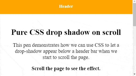
First, have a look at this codepen, that demonstrates the effect:
Now for the implementation details. I decided to keep it low on class names and use a header element as the basis for the demo. Inside this header, I nested a div to contain the header content. And that’s basically all the markup you need. I threw an h3 with a caption in there for the demo but that can be anything you like.
HTML
<header>
  <div>
    <h3>Header</h3>
  </div>
</header>
Then the styles. This is where all the magic is happens. I am not copying everything here, for details check the codepen, but let’s look at a condensed version and see what is happening.
CSS
header {
 height: 80px; /* 64 + 16 */
 position: sticky;
 top: -16px;
 z-index: 1;
 -webkit-backface-visibility: hidden;
}

header::before,
header::after {
 content: '';
 display: block;
 height: 16px;
 position: sticky;
}

header::before {
 top: 48px; /* 64 - 16 */
 box-shadow: 0px 2px 5px rgba(0,0,0,0.5);
}

header::after {
 background: linear-gradient(white, rgba(255,255,255,0.3));
 top: 0;
 z-index: 2;
}

header >div {
 background: orange;
 height: 64px;
 padding: 20px;
 position: sticky;
 top: 0px;
 margin-top: -16px;
 z-index: 3;
}
Ok, so that’s quitte a bit of CSS. So how does it work?
Those of you who have been working on websites back in the day, when we had to use tables for lay-out, might remember this golden oldy: CSS sliding doors. We used to use multiple images that we let overlap one another to create the illusion of rounded corners. Of course today we just use border-radius, but the idea is still relevant today. I used it here to create the illusion of the shadow appearing on scroll. In fact what is happening is that we reveal the shadow on scroll by making it sticky and then having a cover element that slides away with the page content.
In the CSS above, we make the header element 16 pixels taller than we actually want it to be. We then set it’s position to sticky at top:-16px. Using a negative number here allows the header to slide out of view for 16 pixels. These 16 pixels are what we need to have a cover element below the header which will slide up, behind the header content, revealing the drop shadow below. For this cover element, I’m setting the background to a linear gradient from the background color to a partially transparent background color. This creates a gradient that will make the shadow smoothly appear on scroll.
I am using a third element for the shadow itself, because the cover element needs to be hidden behind the header content and the shadow needs to be behind the cover. That’s what those z-index rules are for. The shadow and cover elements are made from the header::before and header::after pseudo elements. So no extra markup needed. We apply sticky to these pseudo element and set the right values for top. Finally, we apply a negative margin top to the header content (the div inside the header element) to compensate for the fact that our outer header element is actually 16 pixels too tall.
I encountered a weird flickering issue in Chrome which was easily solved with this one extra line of CSS: -webkit-backface-visibility: hidden; Too bad there needs to be a hack in this CSS but that’s inherent to the web it seems. Ah well.
So, what do you think? Would this be useful? Does it work on your browser? Can it be improved further maybe? Please share your thoughts in the comments below.
 Stijn de Witt
Hi mate,
I’m searching an idea to resize the icon when we scroll down without using js any idea?
Thx
Yeah it would be uber cool! But alas I don’t think it can be done. Position: sticky is the closest I have come to styling based on scroll position
This doesn’t really work on iOS…Seems the ::before and ::after elements don’t move as expected on iOS Safari and Chrome.
why so complicated? simply put a small fixed layer with shadow behind the header which gets visible when the header shrinks. example: mybricks.net
Yeah it works great.
But can you make it work when the header does *not* shrink?
So when the header stays the same height?
Codepen with an example please 🙂
Hope this solution helps, https://css-scroll-shadows.now.sh/?bgColor=92f990&shadowColor=222222&pxSize=6
@Siddharth interesting approach but this is not going to work in most cases as the children elements will overlap it (imagine having a textarea scrolled to the top – bam, no more gradient).
Thank you!! : D
This is so far the best solution I could find, because you did (almost) not add any extra pusher / shadow elements. Well done!
After a little bit of fiddling with the numbers and top/bottom I managed to create a sticky footer.
The only thing that I’d like to improve is to have a header/footer is not a fixed size, but unfortunately I have no success yet. Any idea if this is possible?
Thanks for your comments Frank and Lucy! Always appreciated 🙂
About the header with non-fixed size…. Yes it should be possible.
The trick I used at some point was to create a header that is larger than is on screen and use position_ sticky to allow it to scroll out of screen for a bit (thus shrinking in perceived size) afer which the effect of the shadow becomes visible. I used a negative position i.c.w. position fixed. I actually once started building a library that was supposed to emulate all of Material Design using pure CSS. A bit too ambitious so I never finished it… But I did know I got the non-fixed header working at some point.
You can have a look at that project, but beware that it’s unfinished and broken and all so don’t shoot me if it does not help you. The project is here:
https://github.com/Download/solids
And you should be able to find an example of the fixed vs non-fixed size header drop shadow here:
https://github.com/Download/solids/tree/master/topappbar
I think the combination of `prominent` and `fixed` is what you are looking for.
https://github.com/Download/solids/tree/master/topappbar#fixed
https://github.com/Download/solids/tree/master/topappbar#prominent
Great post!
For Safari it seems you need to replace “transparent” by “rgba(255,255,255,0)” – see https://stackoverflow.com/a/46165475/2544163